Docs Iteration Prototype
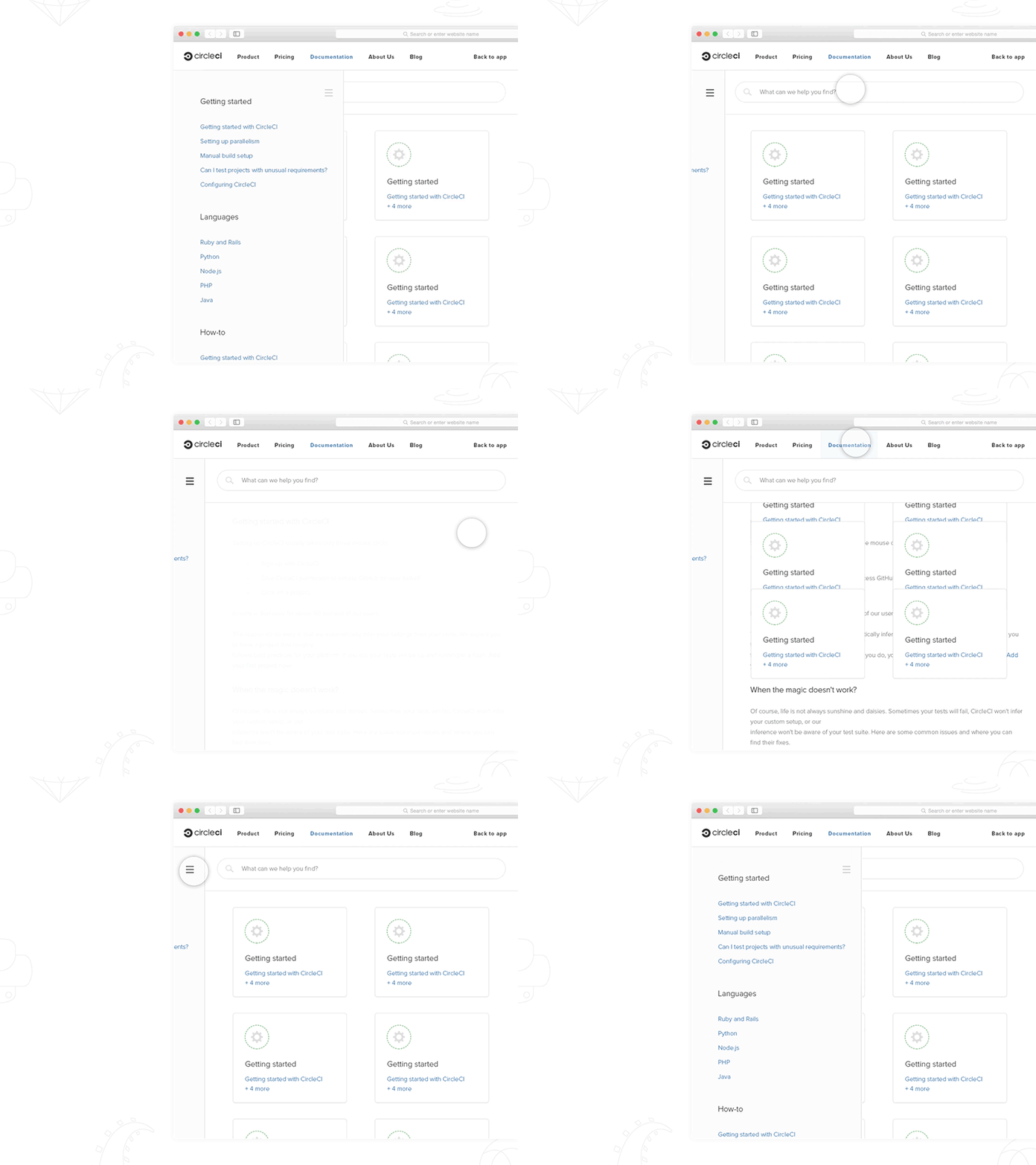
We learned some people, as part of their setup, view our docs on half of their screen and write code on the other. Something like so, a common setup for those working on 13” and 15” laptops.
This prototype demonstrates how our docs could be interacted with after the sidebar would become more of a dismissible menu when the screen decreases to certain breakpoint. I think this solution betters fits peoples' setup as the docs can be navigated and viewed at such screen sizes without disrupting their workflow.
The GIF is a wee bit slow and doesn’t show scrolling so attached is the prototype. This is my first @Framer prototype, thanks to @Ben Adamson for the introduction during the week (:
docs-redesign-iteration-prototype.framer.zip
600 KB
More by Daniel Beere View profile
Like


