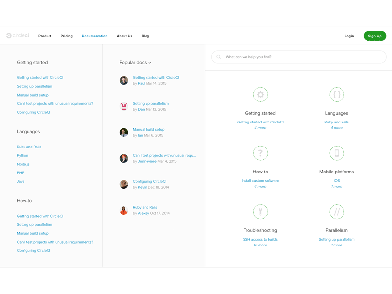
Docs Redesign WIP
We noticed a lot of support tickets were being solved by redirecting those to our docs, so we felt there would be some value redesigning our current implementation (and ideally help reduce the burden on support caused by poor usability and docs discovery). We didn’t have a docs homepage as such, based on conversations with support we learned there’s a number of docs that solved a “majority” of queries, which led us to explore the Popular Docs piece.
Precursor served two use-cases for me during this project. One, to jot down my ideas and two, to clarify designs when working with developers. An example of this, there were some undefined design decisions around how ("wonky") the docs could look on a 27” Apple monitor, a quick jump into Precursor with the developer helped iron out some issues, that my earlier mockups didn’t quite get across.
The GIF is a wee bit quick, check out the attachment (:
Edit: Search (especially autocomplete) was broken, so this was an opportunity to fix that too and help docs discovery. Also, experimenting with avatars and author names, to add some sort of (if any) social aspect to docs as well as giving those more ownership over the docs they write and update.


