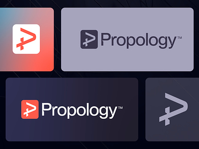
Propology - Logo Concept v4
Propology is equalizing access to high-quality real estate data.
Concept
Upon further exploration of my initial (first) logo concept for Propology, I came across a unique idea of utilizing the symbol as a spark. What appeals to me about this approach is how the shape of the logo remains intact, and the curvature blends seamlessly. This concept aligns well with the company's mission of offering high-quality real estate data through its smart AI tool.
Happy to hear your thoughts and have a lovely Friday! ✌🏻
___________________________________________________________________________________
___________________________________________________________________________________
Let's work together and elevate your brand! 🚀
Feel free to reach out via Dribbble DM or E-mail:
👉 info@jeroenvaneerden.nl
💼 Connect with me on LinkedIn / Read my Client Recommendations
🎬 Check my YouTube for Logo Tutorials / Learn Logo Design
🔗 Follow me on Instagram / See BTS and New Content
💬 Tweet with me

