Propology - Logo Concept v3
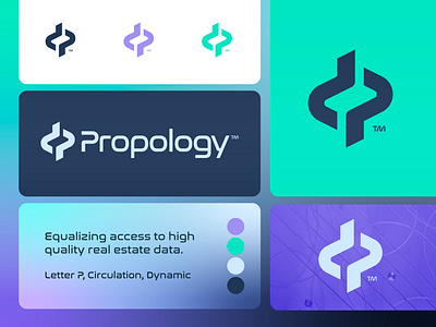
Propology is equalizing access to high-quality real estate data.
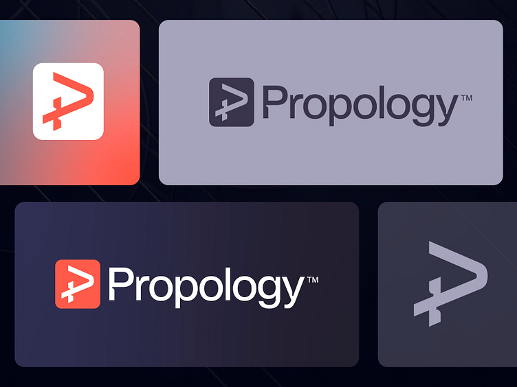
As I was preparing to explore some alternative directions, I further experimented with the letter P approach, incorporating a plus sign to symbolize 'creation' and 'premium'.
To ensure the symbol's coherence with the current typography, I utilized the same corner gaps, which also lend the symbol a more dynamic and swift appearance. Incorporating a box has resulted in a well-balanced full identity.
I am open to hearing your feedback and words of support at this time.
Have a great day everyone!
Jeroen
___________________________________________________________________________________
___________________________________________________________________________________
Let's work together and elevate your brand! 🚀
Feel free to reach out via Dribbble DM or E-mail:
👉 info@jeroenvaneerden.nl
💼 Connect with me on LinkedIn / Read my Client Recommendations
🎬 Check my YouTube for Logo Tutorials / Learn Logo Design
🔗 Follow me on Instagram / See BTS and New Content
💬 Tweet with me

