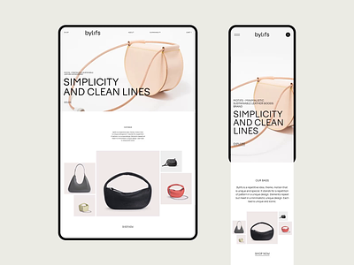
Bylifs: Main page interactions
Hi friends!
As promised earlier, we tell and show more details about our fresh website design for Bylifs — European handbag brand.
This time we'll put some attention on the home page, specifically on its scroll.
We aimed to sync the interactions with feelings of site's design: clean, stylish, unique and tech-driven. These characteristics are inspired by the DNA of the brand.
Of course, this is only a small part of the work that has been done and there are several other publications on this project to come. So subscribe and keep up to date!
We hope you like it! Press "L" if you do and let us know what you think in comments 🖤
Team:
Web Designer — Maria Tipiaeva
Branding — Designpunkt
Project Manager — Olga Krupps
Art Director — Maxim Berg
Made by Sick
Follow us:
