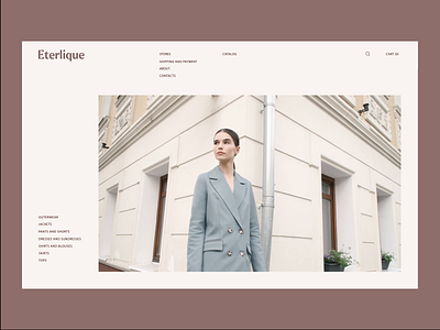
Eterlique: catalog
Hey, friends!
We are back with more interactions for Eterlique store.
Here is the connection between catalog and product card. Catalog card has a vertical image slider - it works just on scroll. All text information remains sticky until the end of the slider, after that we have basic «you might also like» section and a footer.
As for catalog, the filter panel is sticky to the left side and always in front of your eyes. Color variety of each catalog item becomes visible on card hover. Also we use ‘zoom out’ effect on image hover.
Please, let us know about your thoughts in comments and press "L" to show your 🖤
ㅤ
Team:
Web designer — Margaret Plotkina
Branding — Designpunkt
Project Manager — Olga Krupps
Art Director — Maxim Berg
ㅤ
Made in Sick.
Follow us:
