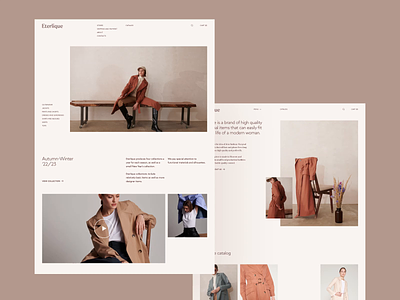
Eterlique: main page interactions
Hi, guys!
It is time to show some interactions for Eterlique store case. Today we want to tell you about the animations on the home page and its connection to the creative concept.
We made a smooth animation that brings the minimalistic design to life. At the same time, the animation contains a feminine energy, a sliding forward motion like a modern urban woman going about her business in elegant and functional Eterlique clothing.
Elements appear on the screen with slight asynchrony. Also, some elements are rhymed: for example, photos and text appear from the bottom up, emphasizing the scrolling motion.
Please, let us know about your thoughts in comments and press "L" to show your 🖤
ㅤ
Team:
Web designer — Margaret Plotkina
Branding — Designpunkt
Project Manager — Olga Krupps
Art Director — Maxim Berg
ㅤ
Made in Sick.
Follow us:
