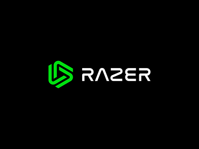
Rebound – Razer Logo Redesign
Hey Dribbble,
I really loved Dennis Pasyuk's RAZER redesign (check it out here: https://dribbble.com/shots/20007767-Razer-Logo-Redesign), but I felt like it was missing some key features that made me think of the Brand.
Namely, it was the 10º tilt on the snake-head Green Logo, and the three lines representing the "E" as is shown on Razer's current Twitter page.
I also wanted there to be continuation in the green snake mark between the old and new shapes (i.e. I wanted it to pass the blur test).
Again, still love Dennis's remake, just wanted an excuse to break out some shape–builder.
More by Alex View profile
Like

