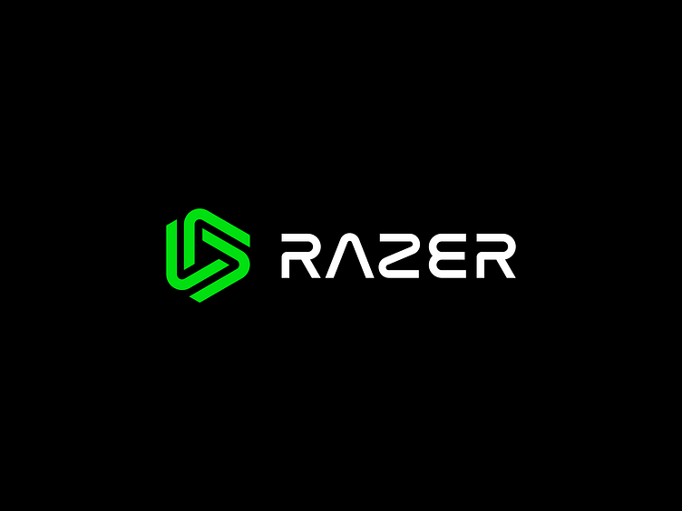
Razer Logo Redesign
Hey Dribbble, finally getting around to posting this one but way back I took a stab at redesigning the Razer logo with a minimalistic approach. The mark retains the rotational symmetry of the current while simplifying and cleaning up itself as a whole. The wordmark was custom built and takes a bolder weight to increase legibility, as well as some rounding to sit next to the mark nicely.
More by Dennis Pasyuk View profile
Services by Dennis Pasyuk
Like


