Balenciaga Mobile App Design Concept
💌 Have a project idea? We are available for new projects!
hello@ronasit.com | Telegram | WhatsApp | Website | YouTube
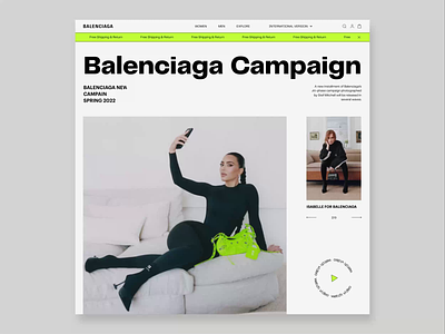
Hi everyone! Have a look at our new concept of the Balenciaga eCommerce application. When designing this concept we tried to replicate the style of Balenciaga's website and add a few fresh touches.
The first screen displays the influencer’s photos, the campaign description, and a list of available items. The second screen is a product card that displays item photos, their price, a size guide, and a CTA button.
This concept was created in the style of brutalism and completed with vivid accents. These features look up-to-date and refer to the aesthetics of the 1990s at the same time.
When designing this concept, we tried to stay consistent with Balenciaga’s official site visual style. But we made it a bit bolder by adding vivid neon green accents.


