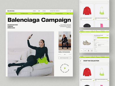
Balenciaga Ecommerce website redesign concept
💌 Have a project idea? We are available for new projects!
info@ronasit.com | Telegram | WhatsApp | Facebook | Linkedin | Website
The process of redesigning sites of famous brands is never easy. You need to stay consistent with their original style and at the same time offer completely new features. Today we want to share with you our revamp of the official Balenciaga site! Here are a few screens.
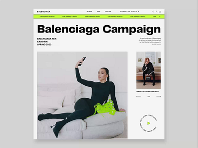
The home page introduces users to the new Balenciaga collection. The next screen displays the list of items available for purchase. The third screen displays detailed product information: color, size of the item as well as payment and delivery information.
For this concept, we chose a minimalistic black and white color palette with neon green as the only accenting color. This color choice doesn’t distract users from exploring the product cards.
When creating this concept, our designers tried to be as consistent as possible with the brutal Balenciaga site style. The neon lights used in our concept make the site look bold and trendy.


