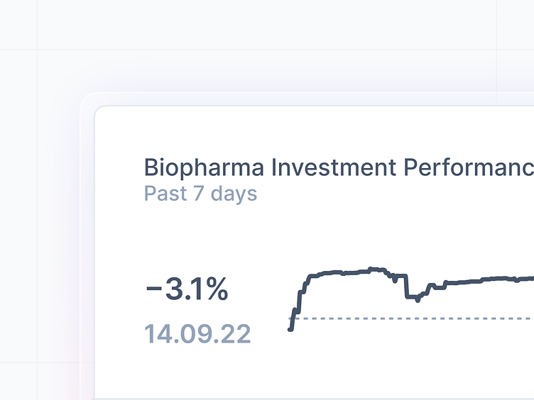
Tiny Charts – an alternative to Sparklines (1)
A few months ago I tweeted a little rant about sparklines/dashboards, where I talked about how they are misused, and most often completely incomprehensible. Over the last few weeks, I came up with some designs which I think are a superior alternative to the sparkline. This post marks the first of a series about designing better sparklines, which I call Tiny Charts.
Here is the final variant for this Tiny Chart, comparing a time period and fluctuations around the 0% mark.
The component itself is also great for creating a stack of Tiny Charts, so that different categories can be compared to each other.
That's it for today ✨
Follow along on twitter for updates.
More by Severin Landolt View profile
Like


