Getting there...
Getting there now.
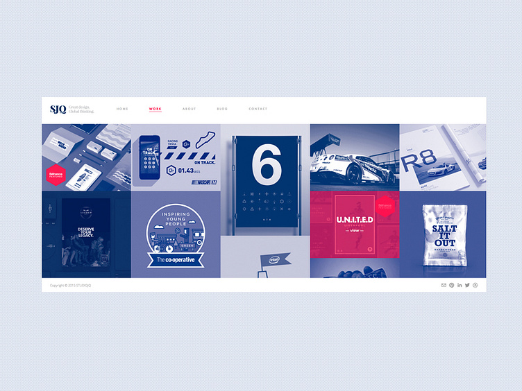
Layout and structure of the website refresh for STUDIOJQ. Using two bold colours to compliment each other, loving the red and blue combo! New FEATURED buttons now added and red (some may say pink :p) roll over. Slowly coming together!
Over the years my style has changed, but looking back I can see I have always loved to design with a minimalistic style. Less is more for me.
Development here: https://www.behance.net/wip/57239
More by MadeByStudioJQ View profile
Like

