Red vs Blue
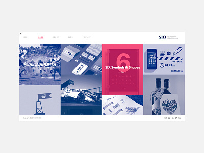
Layout and structure of the website refresh for STUDIOJQ. Using two bold colours to compliment eachother, loving the red and blue combo!
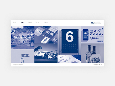
This time for the work section of the site, using a duotone to let each project sit next to each comfortably.
Over the years my style has changed, but looking back I can see I have always loved to design with a minimalistic style. Less is more for me.
Development here:
https://www.behance.net/wip/57239