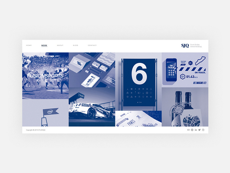
Minimalism (Work)
Layout and structure of the website refresh for STUDIOJQ. This time for the work section of the site, using a duotone to let each project sit next to each comfortably.
Over the years my style has changed, but looking back I can see I have always loved to design with a minimalistic style. Less is more for me.
Development here: https://www.behance.net/wip/57239
More by MadeByStudioJQ View profile
Like

