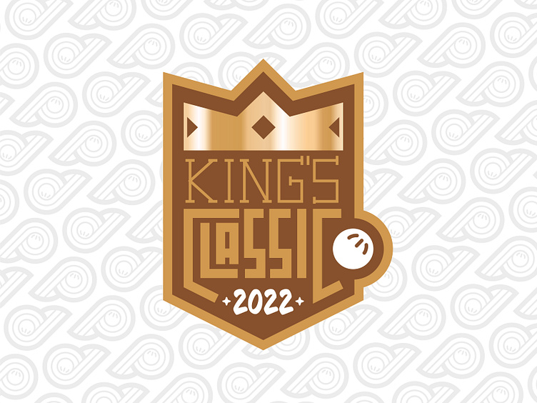
King's Classic Logo (rebound)
Changed this one a little bit. Contained the ball in the shape, changed the year font, gave the crown a metallic glare, moved the star... I dig this one better. Not 100% set on the year font but that's okay. I think I can be done for now.
More by Nathan Rundio View profile
Like

