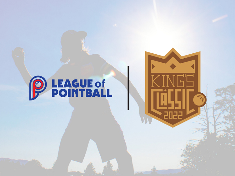
King's Classic Logo
Our wiffleball league's upcoming season is going to have a mid-season tournament called the King's Classic. Since I've been working on the branding for the league, I've been tossing around ideas for the Tournament's logo and came up with this one... I may or may not keep it. I dig it overall; but I feel like the ball needs motion lines or something and the star can be a bit more pronounced (how, not sure). Also, I may round the numbers a little... it's a work in progress
More by Nathan Rundio View profile
Like
