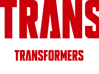
Transformers Logo
Part of our job during the rebrand of Transformers was to help clean up the communication of the brand at retail. With numerous different versions of the logo, countless different rendering styles, and letterforms that spoke more to the past than the future, we determined that exploring a new logo for Transformers would be beneficial.
The letterforms were drawn to pull equity from the original logo into a more contemporary mark to help position the Transformers brand for the future. The simple red and white color palette unifies all the different brand segments at retail and helps to position Transformers as the world class brand that it is.
Check out our full case study on Transformers here.
More by Pilot View profile
Like

