YouTube Redesign V2

Hi guys,
Less than a year ago, I published my first redesign. I had chosen as target : YouTube.
Basically, I tried to improve the ergonomy and visual design for a better user experience.
From several months, I want to throw up everytime I'm seeing this stuff on my profil and delete it. But I had a better idea : make it again.
By doing this subject twice, I should be able to see if my design level is going up.
There are much UX & UI mistakes on my previous stuff so let me know your mind about this shot.
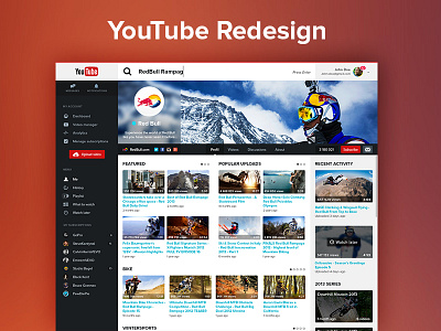
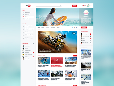
So here it is.
- Same search bar of Android : simple and clean, you can easily recognize it as an input and guess it's the search bar.
- Less is best : less informations there are, better it is. Just give to users what they need.
- White spaces for eye-comfort : I likes making clean and light interfaces causes they're often a pleasure for eyes. It's easier for eyes to identify different parts of your product. He also quickly reach to what he's looking for.
- Icon identity : we often see, icons without any signification assigned to incoherent text. I tried to join those 2 points and make a simple and understanding icons identity.
- Simple grid : I decided to use a simple but efficient grid adapted for massive videos feed.
Comments, feedback, likes and follow are always welcome
You can also follow me on :