YouTube Redesign (Profil page)

I’d like to introduce you to my first redesign : the YouTube profil page
Firstly, I’m sorry for my english which isn’t perfect. I’m french.
You need to know this is my personnal vision. I just tried to do a clean and intuitive design thanks help of youtuber’s friends.
Your opinion is important for me, all reviews are welcome :
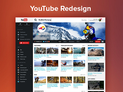
✓ It’s easier and more intuitive to upload video : button is more visible and impacting thanks to its location.
✓ I decided to separate Google’s notifications and private messages from Youtube account. This allows a faster communication and organization.
Recently, private message are notified by mail in your google mail. It’s spamming. That why my concept offer an external mail box.
✓ We can easier discern Google account thanks to borders which Google’s colors.
✓ I sort informations according to its impact or context.
✓ I tried to enhance to navigation by more intuitiveness.
✓ The preview of video by image is the first contact with users. It should decide if users could watch your video or not. That’s why I decided to put images and preview bigger.
✓ No video description when miniatures : few people read the description of video. Only title and preview are decisive.
Comments, feedback, likes and follow are always welcome
You can also follow me on :