Revising
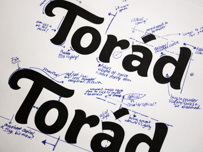
Revising the vectored version. Updated quite a few things from the sketches to combine the best aspects of both versions.
Of course though, I'm stuck with two slight variations for the 'T'. The top one has a much straighter stem and the end points outwards, a bit like cursive/calligraphy. The stem of the bottom one flares slightly and points the other way - the idea being that it mirrors the shape at the top of the 'd' to create continuity, both pointing inwards towards the rest of the word.
EDIT: Full size version - http://bit.ly/meo5q1
More by Claire Coullon View profile
Like

