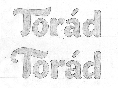
Logo sketches
Two logo variations for a new project I've been working on. Going for a blend of a heavy-weight sans serif with a hand painted logo. I wanted something bold that can have a lot of impact, but also has a distinctive and slightly playful touch.
The top version has some straight lines and elements from a more conventional sans (the 'a', the arm of 'r'...) The bottom one has more accentuated curves, closer to a brush script.
At the minute, we're leaning towards somewhere in between, but not sure the T - maybe a cross between the two? Open to suggestions/thoughts! (Ignoring the rough spacing)
More by Claire Coullon View profile
Like
