Inen process section

As promised, this is the followup to last week's shot, which redesigns Farzad Ban's Inen agency. In this Process section, I improved on several aspects of the design.
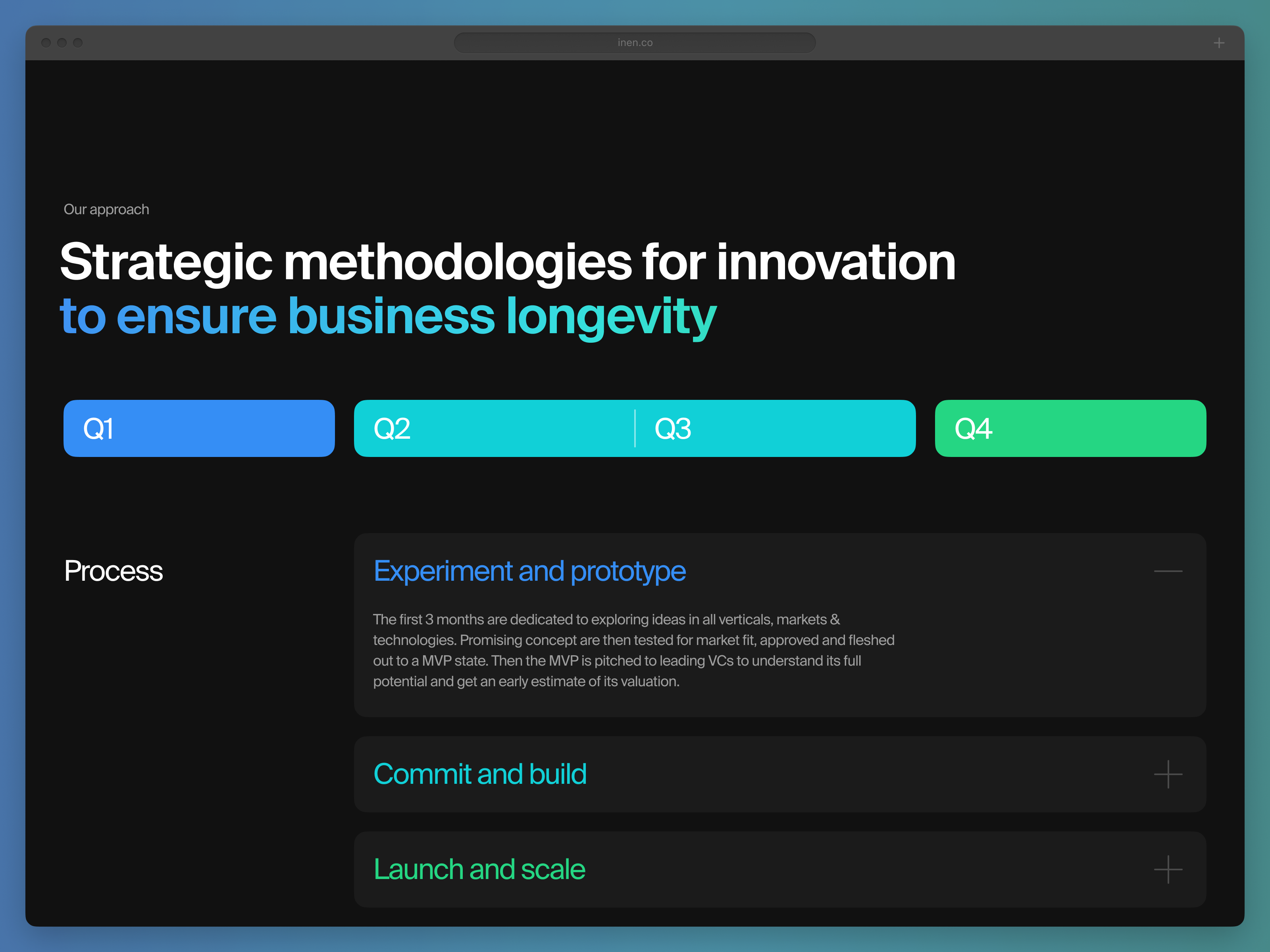
Previously there was extremely tight spacing, no subhead, overly long heading copy, the pre-existing solitary regular font weight, and full-width overly long line-length, muddy, low contrast colors, and blurry icons.
In the redesign, we see proper relationships between sections in their spacing and proximity, a more manageable section heading to read, a pleasant use of quarter and three quarters sections of the grid, multiple levels of font size hierarchy, saturated and legible colors, and improved icon legibility.
See all the changes:

