Inen hero section
I've been really enjoying @farzadban's work in expanding what can be done with negative space and seeing what's possible with restricted typography. But some of the work on his agencies' sites could be vastly improved by just referring to convention and employing more contrast. As an exercise, I attempted to improve on Farzad's work for his agency inen.co and see what felt off about it, despite it having a good experimental quality.
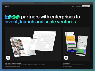
A top navigation was previously non-existent, so adding that was helpful for orienting. Additionally, I worked out the buzzword-heavy sales pitch in the hero so that it was much easier to absorb and interpret, as well as emphasizing the key portion with a brand-based gradient. The length of the original header text is an issue in itself for interpretation, but also it doesn't have the necessary breathing room.
With type, not everything has to be a single Regular weight. If you expand to two weights, you can have a much higher quality result. Also, by adding an additional smaller size for text descriptions beneath the device imagery I create a sense of hierarchy and priority.
The hero image is so tall that it isn't entirely viewable to see the image and its description on many monitors, so making it a split of two images it possible to see what you're looking at, and adds interest. I also changed the overly contrasted light grey on black backgrounds for the images to dark grey on black. This makes the screens, devices, and app icons stand out much more.
I will post the second half of this redesign later. This is all for now.
See all the changes:
