Optifrais - Pictogram of the Logo
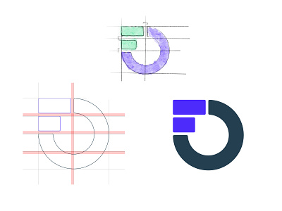
Here is the close-to-final aspect of the logo.
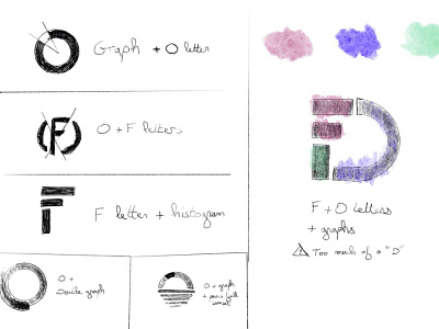
I played earlier on the different shapes and explorations (see rebounded) and decided to remove a bit of the F to close the O so it doesn't look like a F + D.
The F is more readable but I prefer the shapes like this : 0 + graph + histogram.
Optifrais is here to optimize your family fees for free. So I wanted to play with graphs and the letters O and F to get a simple and readable shape.
Other shots coming soon.