WIP COVER
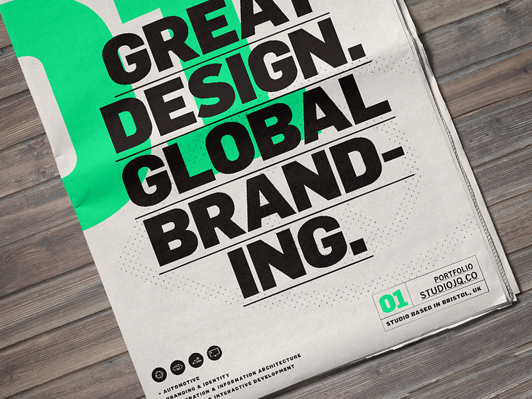
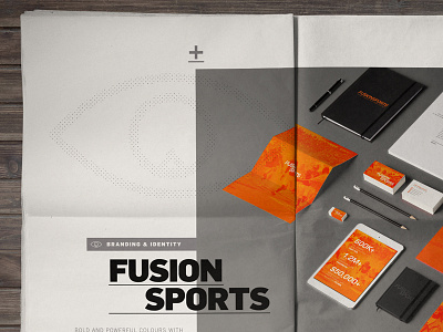
A sneak peek of my brand refresh and portfolio review layout as a newspaper mock up. Hugely influenced from Swiss style design focusing on big typography, overlapping and a strong accent colour. Using the vibrant green and mono typography.
If only my local printers they could print spot on newspaper stock :( Gonna have to stick with Grey instead of the green! What could of been!
Follow my journey here: https://www.behance.net/wip/413971
More by MadeByStudioJQ View profile
Like

