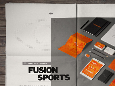
2014 Portfolio // FusionSports layout
Development of my brand refresh and portfolio review layout as a newspaper mock up. Hugely influenced from Swiss style design focusing on big typography, overlapping and a strong accent colour.
Follow the development here:
https://www.behance.net/wip/413971
Full branding project here:
https://www.behance.net/gallery/14621983/FusionSports-Branding
More by MadeByStudioJQ View profile
Like


