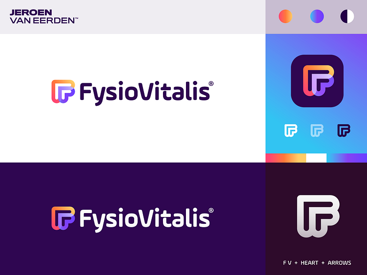
FysioVitalis - Logo Design v8
FysioVitalis®️ - Logo Design v8
FysioVitalis is specialized physiotherapy and lifestyle improvement studio in the Netherlands.
About this concept: The idea was to combine the following elements to identify FysioVitalis and embrace who they currently are and where they planning to move into in the future:
1. Letter(s) F + V to represent a monogram of the name. 2. Heart shape to refer to health and joy in life. 3. Arrows and overlapping lines/shapes refer to the cycle of treatment. 4. Colors give sense of friendlyness and a fresh new start.
The one-colored version is a test to see how this mark performs when used without the overlay effects. I think this mark is dynamic enough to tick all the boxes above.
Have you ever seen a similar mark? Do let me know so I know if proceeding in this direction has enough potential. All the feedback is welcome at this stage.
Interested in working with me? Let's make a mark, together!

