FysioVitalis - Logo Design v7
FysioVitalis®️ - Logo Design v7
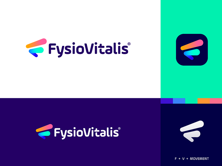
FysioVitalis is specialized physiotherapy and lifestyle improvement studio in the Netherlands.
About this concept: I tried to find a way to use two arrows that creatively form the letters F and V into a monogram. The flow of these lines represents energy and speed and brings back positive vibes with a focus on healthy and a fun lifestyle.
The problem with the previous concept was that it also looked a bit like the letter M, which could confuse some of their users and audience.
Have you ever seen a similar mark? Do let me know so I know if proceeding in this direction has enough potential. All the feedback is welcome at this stage.
Interested in working with me? Let's make a mark, together!

