Columbus Crew Rebrand - Concept
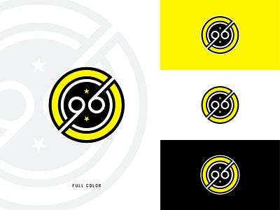


My take on what the Columbus Crew rebrand should have been.
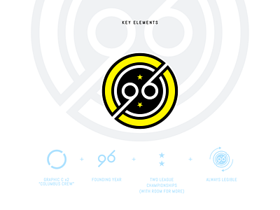
This concept streamlines the previous logo into a sleek and modernist design. Inspired by great European clubs with impeccable pedigrees, this badge focuses on the deep history of the Crew and their place in the pantheon of American soccer.
The Crew was founded in '96 and have two league championships to their name, these elements are at the heart of who the Crew are today. The subtle graphic Cs on the outer perimeter of the badge are a nod to the city of Columbus, and the Crew nickname. The use of #Crew96 on twitter makes me believe this would be a viable option and embraced by the community.
Please let me know what you think and hit F to share the love!