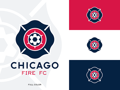
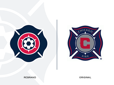
Chicago Fire Crest - Concept
My take on what the Chicago Fire crest rebrand should have been. In my opinion it was a mistake to move away from the Florian Cross crest shape, which was one of the most unique crests in all of sports.
This concept streamlines and simplifies the existing logo into a timeless mark which will work for digital and print applications, and frankly would look dope on merch (see embroidery mockup on the 5th image).
The key element of the logo is the use of the iconic Chicago 6-point star, which forms the classic Telstar soccer ball when combined with a circular container shape.
Please let me know what you think and hit F to share the love!
More by Alex Kurr View profile
Like


