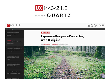
UX Magazine + Quartz Mashup
So I really like @Handsome design exercise they have done. They reapply the visual aesthetics of one site to another. I wanted to get in on the fun, so I took UX Magazine and applied it to the layout of Quartz. Check out the larger view attached.
I couldn't agree more with @Chris Bannister statement in his post. "If you know it I'm sure like me you may have thought it's a little ironic how a blog about user experiences provides a pretty frustrating experience (especially on mobile)."
I personally love Quartz's reading experience from desktop to mobile. They are a native news outlet for the new global economy, and they are killing it in terms of design, advertisements, and engagement. I hope to see more blogs, news outlets, and even advertisements take a new shape in 2014.


