UX mag redesign GIF
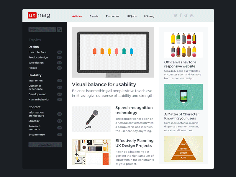

Took an hour or so out of my Sunday to do a quick redesign concept of the ux mag website. If you know it I'm sure like me you may have thought it's a little ironic how a blog about user experiences provides a pretty frustrating experience (especially on mobile).
My apologies for the poor quality gif but it's mainly to illustrate the simple functionality and structure, while providing a decent experience. Check out the attachment for a better look.
As always comments are appreciated, and I'm also here