Sber Logo Concept
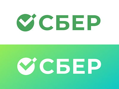
Hey, Ivan! Here's my version.
I think that the classic color is strongly associated with the Sberbank. So I removed unnecessary details and made a checkmark more clear but kept a connection to the previous logo.
I chose more geometric font to highlight the interaction between symbols and the text. Now the logo is more balanced and straightforward but still recognizable.