Sber Logo Concept
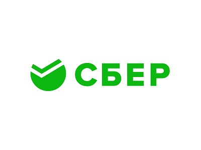


A couple of days ago one of the biggest banks in Russia — Sberbank — announced a rebranding. Now there is a lot of controversy about the new Sber style. I had my own vision of this rebranding and it's not matching with the new one. So I decided to give it a shot and made my quick version of this logo (it took me about 20 minutes).
What I've done:
— I think legacy is important for such big brands so I simplified the old symbol.
— Used Grotesk typeface for the text part, fits more for the modern company with a lot of digital products.
— Made it solid green, but a little bit brighter than before. This color + old Sber symbol is a strong archetype, like the green cross on drugstore signs.
I like the result and it was a fun exercise!
