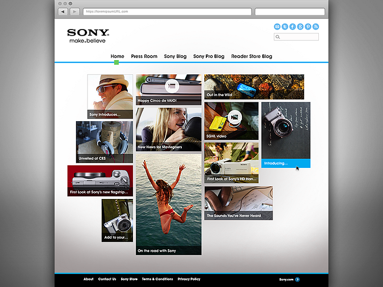
Home Page Design for Sony.com's Blog
As you can see, this design mockup is based on the structure of the wireframe, while not identically emulating it. Between completing the wireframe and working through iterations of the design, I felt an asymmetrical grid with fewer content tiles would be more appropriate, providing some beneficial white space around the perimeter. The blog has fairly simple navigational requirements, underscoring the concept that this blog is a clearinghouse for event happenings and product news. As such, the content is the primary focus. I want the interface to fall away (visually speaking).
With the architecture tools in place (both sitemap and wireframe deck), combined with the discovery phase's technical, functional, creative/brand requirements, and client sign-off of the visual direction, the next step was to continue page design creation, followed by production and specs for development. And that is a peek into the process.
Thanks for reading! :)

