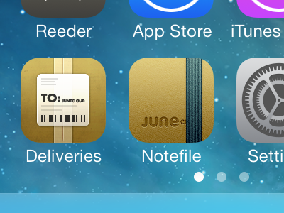
Notefile for iOS icon, once more
As I commented on the previous shot, the main texture on the Notefile icon was actually blurry at the top, so I finally took the time to clean it up. I spent a ton of time messing with various parts of this today, but it's actually pretty close to the previous shot—just more refined all around.
I also tweaked Delivery Status a bit. The previous gradient was a bit too drastic compared to other iOS 7 icons (and Notefile), so I brightened the bottom slightly. I also removed a highlight from the top edge of the tape that shouldn't have been there.
P.S. I love brown but ugh I'm never designing another brown icon again
More by Mike Piontek View profile
Like

