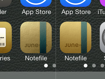
Notefile for iOS icon
I was reasonably happy with the Notefile 2.0 icon (on the left) but I've gotten a few complaints from people who don't think it fits in well. After talking it over and trying it on a bigger variety of wallpapers I decided I could objectively improve it with some subtle tweaking (on the right).
Of course now that I've spent hours on subtle variations and I'm about to post it, I hate it, I hate everything, I quit *flips a table*
More by Mike Piontek View profile
Like
