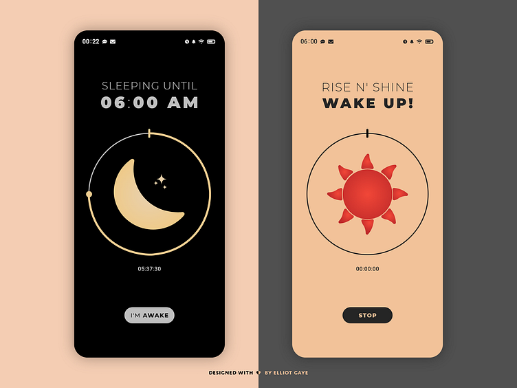
DailyUI #014 - Countdown Timer - Part 2
Hej Dribbblers 👋
This is Part 2 (actual timer) of my #014 #DailyUI design. This is a rebound shot of Part 1 (setup screens) of my sleep alarm app designed for this #DailyUI, Part 1 can be found here - https://dribbble.com/shots/12264729-DailyUI-014-Countdown-Timer-Part-1.
Design Hint 💻 - Design a Countdown Timer. Is it for an app? An interface for an oven? A sport related countdown? A launch countdown for NASA?
The Idea 💡 - The idea for today’s UI design is a countdown timer for a theoretical sleep alarm mobile app for Android and iOS. The design will be minimalistic and "straight to the point". It will feature a simple colour palette of mainly Greys and Whites, but once the user triggers the timer it will have blends of Blacks and once the timer finishes and the sun rises, it will feature true Red and calm shades of Orange - for that rise and shine fresh feeling!
Final Thoughts of Part 2 🧠 - For the first part of this design, the sleep screen (left) and awaken screen (right), I continued the minimalistic design of Part 1. This time I changed the colour palette to fit the "night sleeping alarm" screen and "day time awaken" screen respectively, with a true Black and calm Yellow during the night (and a calm Grey for the text so the app would not use as much battery life up) and a calm Orange and sharp Red when the Sun rises. I really like how I have set the colours up in this way, not only for the aesthetics but for the main goal of being more accessible/easy to understand for the end user. The illustrations were made by me as well, these would also act as a way of understanding the time until the alarm rings. Overall, I am very happy with the entire app design (all four screen designs), they're simple to read and understand - yet feel elegant and sophisticated in a minimalistic sort of way.
Hope you like, press "L" if you ❤️ my work!
As always, I welcome any feedback! 😄
Lastly, share the love by pressing the share button if you really like what you see! 👍

