DailyUI #014 - Countdown Timer - Part 1

Hej Dribbblers 👋
This is Part 1 (setup screens) of my #014 #DailyUI design. Part 2 (actual timer) is a rebound of this shot, and can be found here - https://dribbble.com/shots/12265035-DailyUI-014-Countdown-Timer-Part-2.
Design Hint 💻 - Design a Countdown Timer. Is it for an app? An interface for an oven? A sport related countdown? A launch countdown for NASA?
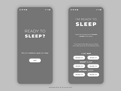
The Idea 💡 - The idea for today’s UI design is a countdown timer for a theoretical sleep alarm mobile app for Android and iOS. The design will be minimalistic and "straight to the point". It will feature a simple colour palette of mainly Greys and Whites, but once the user triggers the timer it will have blends of Blacks and once the timer finishes and the sun rises, it will feature true Red and calm shades of Orange - for that rise and shine fresh feeling!
Final Thoughts of Part 1 🧠 - For the first part of this design, the home screen (left) and set screen (right), I set out to create a simple but straight forward UI. I think I have nailed that! It looks simple yet elegant, and it's straight to the point! The neumorphic design makes the buttons stand out from the rest of the UI, which is nice. The monochromatic colour palette was chosen for these first two screens because its easy enough to read at both night and day time. Overall, I am really happy with the first two screens I have designed as part of my sleep countdown app today!
Hope you like, press "L" if you ❤️ my work!
As always, I welcome any feedback! 😄
Lastly, share the love by pressing the share button if you really like what you see! 👍