How to Age Disgracefully, Step 5: The back of the postcard
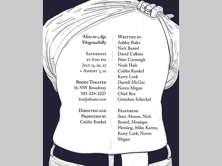
We printed out postcards for the show. Postcards have a back side to them (I know!!) and it's usually printed in black & white.
My punny idea was for the "back" of the postcard to be the "back" of the tattooed person. Vanja delivered another stellar drawing, again within minutes. My favorite part of it is that it portrays such a relatable, normal person. They're not overtly sexy or beefy, but they're not a gross slob either. They're also a "they"; male or female, up to you.
I first hand-lettered another tattoo design with all the info and names for the back, staying with the tattoo premise. However, it was both hard to read (that's a lot of names!) and it carried the joke too far. Instead, I switched to a classy bit of typesetting using Adobe Caslon, a beautifully packaged font with loads of family variations (real smallcaps, swashes, old-style figures, alternates, ligatures, etc.) It's a typeface that screams "theater!!!" to me.
(And speaking of screaming "theater!!!", have I mentioned that you should spend ten bucks to come and see the show? It's gonna be great! http://www.brodytheater.com/nowplaying.html#ad13)

