How to Age Disgracefully, Step 4: Putting it all together
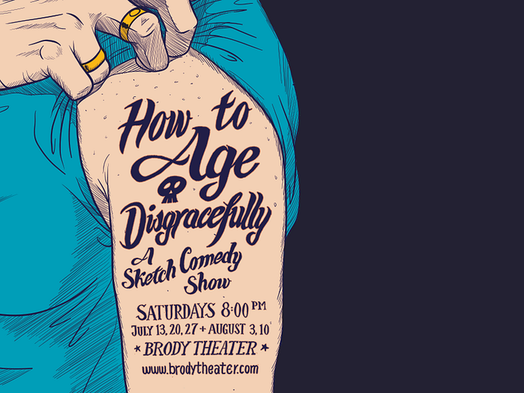
Here's the final image, shown in Dribbble-widescreen. The original is cropped differently; it doesn't include all that dead space on the right.
We decided we needed a subhead to explain what the heck this show IS, and I quickly drew that the same way as the main title. No fonts were used or harmed in the making of this poster.
I did a few version with different shirt colors. Red was my favorite, but the Brody Theater is very red itself, so the poster wouldn't stand out against it. For fun, we decided to do different colors for different applications (poster, postcard, digital, etc.)
