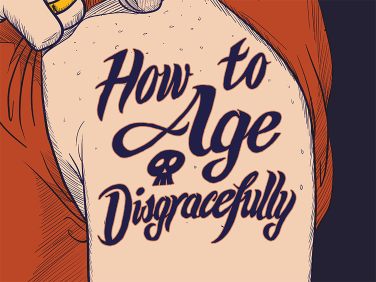
How to Age Disgracefully, Step 3: Illustrator + color
I wanted to show the tattoo on an average person's arm, sleeve pulled back to brag about it. I did a sketch of this arm and it looked… ok. I'm not a great illustrator, and I'm definitely not great at anatomy.
But my brother Vanja is (http://vanja.mrgan.com) He's scary good. After I described my idea to him, he was kind enough to render it beautifully in mere minutes.
This is a cropped view (full image to follow). I decided on bold-but-realistic colors. Vanja advised me to soften the strokes by making them blue/purple rather than black. I added a soft, pink halo to the tattoo to simulate the ink-bleed and skin-irritation you get around tattooed areas. It also made the tattoo feel more organic, more a part of the arm.
(Pitch corner, yet again: Get your tickets for the actual sketch show, really! If you think the poster is neat, you ain't seen nothing yet! http://www.brodytheater.com/nowplaying.html#ad13)

