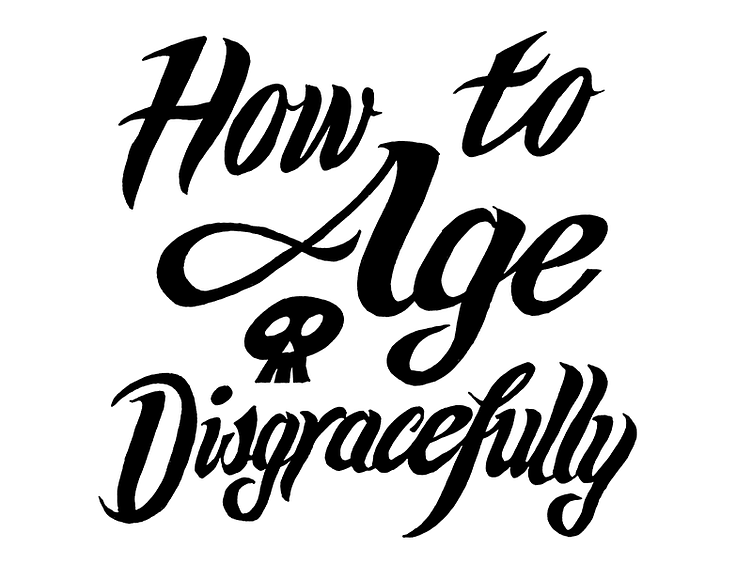
How to Age Disgracefully, Step 2: cleaning up in Photoshop
The poster contains a lot of information: show title, subhead, dates and times, address, ticket price, theater website, etc. Given than, I needed to make the swash-y title legible, so I decided to drop the sweet-ass chrome effect I'd done in pencil. I liked it, but the flat version has its own appeal. It lets the shapes really resonate. I tried it almost as an afterthought, but I ended up really digging it.
This was done the slow and boring way in Photoshop: tweak the levels on the scanned sketch, run the Threshold filter, then fill in and clean up with the brush tool and a Wacom Bamboo.
(Pitch corner continues: you know SNL, right? How would you like to see a funnier, better rehearsed, edgier version of it, with better writing and no boring music guests? Come to our show! http://www.brodytheater.com/nowplaying.html#ad13)

