Koniku 2.0: Detection Visuals

The Detection page is made up of the Health, Food, and Security sections. Every section on the Detection page has its header, with a title and image that serve to quickly and effortlessly engage and introduce the user to the concept presented in that section. For a deeper dive into what I’m talking about here, you can check out the Koniku UX shot we posted recently.
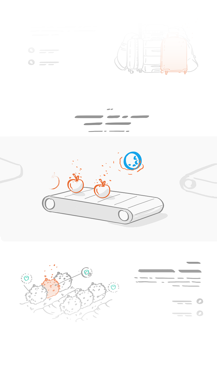
We did the Food section and its visuals first. So, we took some apples and made them materialize on a conveyor belt; had them scanned by the KoniKore and marked as good or bad; and finally made them dematerialize once they came off the other side.
The way this works in reality is pretty similar – the KoniKore can’t make fruit materialize or disappear, but the scanning part is accurate. Fruits give off thousands and thousands of particles that can be analyzed to determine the overall health (i.e. quality) of the fruit. The KoniKore filters these particles and analyzes them by registering how the neurons respond to them. The neurons react to unhealthy particles by becoming “alarmed”. When that happens, a signal is transmitted to the tech components, where it’s analyzed and registered as “bad” in the system. The apple is then arrested and deported back to Mexico, or something like that – I kind of zoned out half way through the presentation, and spent the rest of it wondering why Joe Rogan still hasn’t had Dave Chapelle on his podcast.
The whole idea behind these visuals was to emphasize how subtle and simple the detection process is in practice. Once we accomplished that, all that was left to do was to pack it all up in a pretty loop that introduces the user to the process, and nudge them toward the additional information presented next to it.
—
Team/Credits: Art direction: Petar Stojakovic 3D artist & Motion: Nebojsa Jurcic Writer: Lex Molnar
—
The Detection page is made up of the Health, Food, and Security sections. Every section on the Detection page has its header, with a title and image that serve to quickly and effortlessly engage and introduce the user to the concept presented in that section. For a deeper dive into what I’m talking about here, you can check out the Koniku UX shot we posted recently.
We did the Food section and its visuals first. So, we took some apples and made them materialize on a conveyor belt; had them scanned by the KoniKore and marked as good or bad; and finally made them dematerialize once they came off the other side.
The way this works in reality is pretty similar – the KoniKore can’t make fruit materialize or disappear, but the scanning part is accurate. Fruits give off thousands and thousands of particles that can be analyzed to determine the overall health (i.e. quality) of the fruit. The KoniKore filters these particles and analyzes them by registering how the neurons respond to them. The neurons react to unhealthy particles by becoming “alarmed”. When that happens, a signal is transmitted to the tech components, where it’s analyzed and registered as “bad” in the system. The apple is then arrested and deported back to Mexico, or something like that – I kind of zoned out half way through the presentation, and spent the rest of it wondering why Joe Rogan still hasn’t had Dave Chapelle on his podcast.
The whole idea behind these visuals was to emphasize how subtle and simple the detection process is in practice. Once we accomplished that, all that was left to do was to pack it all up in a pretty loop that introduces the user to the process, and nudge them toward the additional information presented next to it.
—
Team/Credits: Art direction: Petar Stojakovic 3D artist & Motion: Nebojsa Jurcic Writer: Lex Molnar
—