Koniku 2.0: Visual Storytelling – UX


Neurons, cutting-edge technology, and precision engineering – yep, that’s Koniku. Integrating all that sci-fi tech into an engaging and informative experience through visual storytelling, that’s us.
Presenting the esoteric concepts behind that tech into an easily comprehensible visual narrative for a layman audience, that was the challenge.
Being that this is the 2.0 version of their website, and that we made the first one as well, we already had a firm grip on the technical concepts behind Koniku’s vision, as well as an excellent work relationship. Unfortunately, the bright minds at Koniku didn’t sit on their hands since we did the first version, so we had some serious catching up to do in the Who, What, and Why departments; before we could find our way to the How desk and begin working on what you see here.
Fortunately, even though the tech changed, our relationship with Koniku didn’t – we had Nick, our 3-D Artimedies, working with Koniku’s engineers on a daily basis; getting instant feedback and info on the engineering aspects of the project. Thanks to that, we were able to get our creative groove on, while not having to worry about glossing over any technical particularities along the way. Additionally, we enjoyed complete creative freedom when it came to all creative aspects of the project (UX, sitemap, storytelling etc.).
With all that going for us, we had no problems with focusing on both the design and engineering aspects of the project, coordinating them, and later merging them seamlessly. Come to think of it: if anything, the success of this project is a testament to excellent collaboration between our studio and the engineers at Koniku. Also, work. Lots and lots of work.
Just in case we made the whole thing sound easy – it wasn’t. This project also had its “This is impossible!” moments. Namely, it was quite difficult to integrate all the scientific concepts and futuristic nature of the project into an elegant, engaging user experience that supports a strong visual narrative and captivating flow.
We needed time to acquaint ourselves with the subject matter, the freedom to make mistakes, the skills to course-correct, and then some more time to – you know – actually get stuff done right.
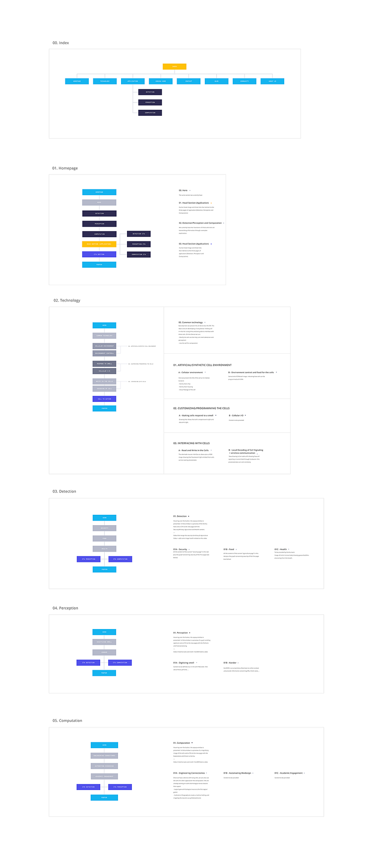
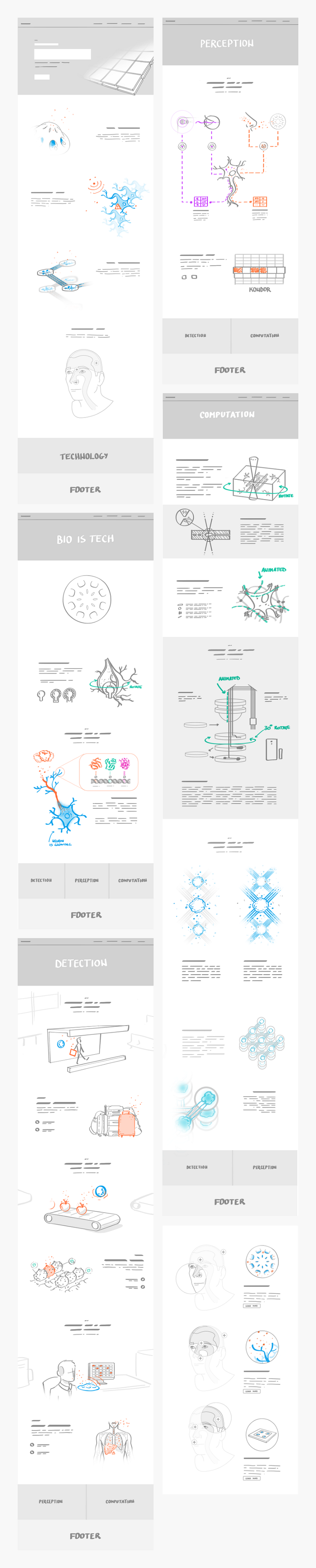
What you’re looking at here is one of the first stages of development that followed the above pattern – the animatic. It illustrates the means and order of content presentation, layout, user flow. In a nutshell, it’s how we intended the end-user to experience the website.
The illustrations presented here serve as a foundation/guidance for later 3-D modeling. We’ll be posting some of these elements and sections, as well as their different styles: neutral, biological, and technical.
Hopefully, now you’re beginning to see how this can get real complicated, real quick: how do you pack 3 completely different themes into 3 types of content that have to stay visually homogeneous, yet somehow unique to one another?
Well, follow us and find out in our next shot 😊 In the meantime, check out the visual storytelling we did with the UX for Koniku’s new website: LINK.
—
Team/Credits: Art direction: Petar Stojakovic 3D artist & Motion: Nebojsa Jurcic Writer: Lex Molnar
—
Neurons, cutting-edge technology, and precision engineering – yep, that’s Koniku. Integrating all that sci-fi tech into an engaging and informative experience through visual storytelling, that’s us.
Presenting the esoteric concepts behind that tech into an easily comprehensible visual narrative for a layman audience, that was the challenge.
Being that this is the 2.0 version of their website, and that we made the first one as well, we already had a firm grip on the technical concepts behind Koniku’s vision, as well as an excellent work relationship. Unfortunately, the bright minds at Koniku didn’t sit on their hands since we did the first version, so we had some serious catching up to do in the Who, What, and Why departments; before we could find our way to the How desk and begin working on what you see here.
Fortunately, even though the tech changed, our relationship with Koniku didn’t – we had Nick, our 3-D Artimedies, working with Koniku’s engineers on a daily basis; getting instant feedback and info on the engineering aspects of the project. Thanks to that, we were able to get our creative groove on, while not having to worry about glossing over any technical particularities along the way. Additionally, we enjoyed complete creative freedom when it came to all creative aspects of the project (UX, sitemap, storytelling etc.).
With all that going for us, we had no problems with focusing on both the design and engineering aspects of the project, coordinating them, and later merging them seamlessly. Come to think of it: if anything, the success of this project is a testament to excellent collaboration between our studio and the engineers at Koniku. Also, work. Lots and lots of work.
Just in case we made the whole thing sound easy – it wasn’t. This project also had its “This is impossible!” moments. Namely, it was quite difficult to integrate all the scientific concepts and futuristic nature of the project into an elegant, engaging user experience that supports a strong visual narrative and captivating flow.
We needed time to acquaint ourselves with the subject matter, the freedom to make mistakes, the skills to course-correct, and then some more time to – you know – actually get stuff done right.
What you’re looking at here is one of the first stages of development that followed the above pattern – the animatic. It illustrates the means and order of content presentation, layout, user flow. In a nutshell, it’s how we intended the end-user to experience the website.
The illustrations presented here serve as a foundation/guidance for later 3-D modeling. We’ll be posting some of these elements and sections, as well as their different styles: neutral, biological, and technical.
Hopefully, now you’re beginning to see how this can get real complicated, real quick: how do you pack 3 completely different themes into 3 types of content that have to stay visually homogeneous, yet somehow unique to one another?
Well, follow us and find out in our next shot 😊 In the meantime, check out the visual storytelling we did with the UX for Koniku’s new website: LINK.
—
Team/Credits: Art direction: Petar Stojakovic 3D artist & Motion: Nebojsa Jurcic Writer: Lex Molnar
—