ProPair - Logo Design / Part 3 ✅
ProPair - Logo Design / Part 3 ✅
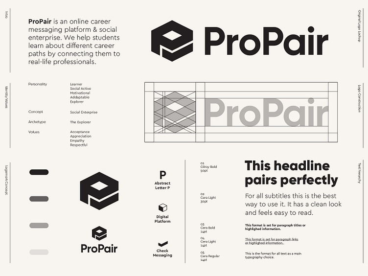
ProPair is an online career messaging platform and social enterprise. They help students learn about different career paths by connecting them to real-life professionals.
Been working hard on this concept and felt this was the best way to go forward with for now. Only not having set on are the colors. Currently busy playing around and tweaking where I can to make this work. Just had to share this update presenting it in all black. Feels really timeless and bold already.
What do you think? And what colors would you suggest after reading above 'intro'?
Letter P + Platform + Checkmark
_ _ _
Interested in working with me? Feel free to reach out: info@jeroenvaneerden.nlwww.jeroenvaneerden.nl
More by Jeroen van Eerden View profile
Services by Jeroen van Eerden
Like

