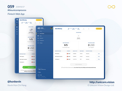
059 - GCFX Web App
Keyword: Navigation
The navigation menu is a must-have component for most of the digital products. It provides a sense of space for letting users know where they are and where they can explore.
We can reference from the iOS human interface guideline or the material design system of Android, there are numerous design patterns suggested, examples like the bottom navigation bar, tab bar, side drawer or toggling the navigation on and off with a hamburger button. The rule of thumb is to try not to ignore the design guide from iOS and Android as the user has already used to the way to navigate. When designing an iOS application, we should use the bottom navigation bar. On the other hand, when designing an Android application, use tab bar or side drawer.
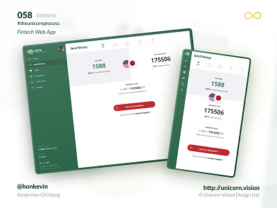
For web design and development, there will be different design considerations in terms of different screen sizes. As it is different from the native platform, there is no standard guideline and suggestion on web applications. Most of the time we will try to inherit whatever looks great from the native design. It works in the past. but if you need to consider working on a progressive web application (PWA), it is going to be a different story.
By Kevin Hon Chi Hang on 2020/02/27
iOS & Android Download: http://bit.ly/36vIDON
Sign Up for Secure Money Transfer: http://bit.ly/3b3KUU3
#theunicornprocess #unicornvision #honkevin #flutter #gcfx #gcfxapp #ios #android #reactjs

