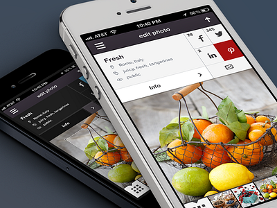
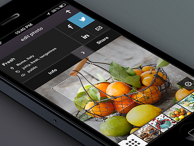
Publish photo (do it white way)
Hey guys,
clients asked me to try the white version for the Publish screen and I'm always up for that. I like to explore different directions.
It resembles the look of the Menu though I stick to coloring the socials. Now we added Pinterest, quite an addictive thing if you ask me so I guess it was a good decision on market side.
Anyway let me know which (and why) of the versions you like better. And always appreciate every bit of constructive feedback you're up to share.
***
Love,
@Julia
More by Julia Khusainova View profile
Like


