Publish photo
Hey guys, hope you had a good Easter.
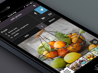
Important screen from photography iPhone app. Initial stage. This is where you can
✔ add details to the photo
✔ crop it
✔ share it
✔ access your library and pick another photo for editing
✔ publish the photo
I tried to eliminate the steps and actually have one step process for the whole publishing/sharing ux. And at the same time keep it simple and straightforward. I want to access all the functions (not much of them, really) from one screen and to be able to quickly get back and to preview how it looks like.
A few notes as always:
✔ arrow on top right is actual publishing button
✔ arrow to the right of the "Info" invites you to add/edit photo details
✔ sharing works as simple as tapping the icons
✔ menu on the bottom is collapsible/expandable
✔ library icon on the bottom left
✔ next to it you see your photos which are in drafts so you can get back to them and finish publishing
Don't forget to check @2x
More pixels for you:
✔ preview
✔ preview with social networks selected
✔ preview with everything unselected, menu hidden, no crop and on white iPhone
***
Love,
@Julia


